200 West 20th Street
In the realm of architecture, the essence of a building extends beyond its facade and structure, weaving a tapestry of style, function, and history. This tale of architectural excellence brings us to 200 West 20th Street, a New York City residence in the heart of Chelsea, where an extraordinary transformation has occurred. Prolific architect Emery Roth gifted this 14-story masterpiece with his vision in 1938. The building continues to evolve with its most recent innovation – two breathtaking elevators. This feature reveals the meticulous artistry behind these elevator interiors and the historical significance that influenced their creation in collaboration with Century Elevator, the elevator contractor, and United Vertical Group.
Hal Jannen, a master of the intricate dance of form and function, drew inspiration from extensive research and field trips to create elevator interiors that pay homage to the Art Deco era. This period is celebrated for its seamless marriage of luxury and sophistication. Jannen's quest for excellence led to meticulous exploration, both online and within the building itself, in an effort to capture the essence of the Art Deco era. The ultimate goal was to transport residents into an atmosphere of upscale elegance each time they stepped into these elevators.
From the very beginning, the board members and Hal envisioned a transformation that would transcend the mundane. When discussing the inspiration behind the design, Hal explained, "We wanted the elevator interiors to have a residential, upscale feel. The previous elevators had been clad in [faux] wood laminate, and we absolutely didn't want that. I worked closely with the board president in choosing [natural] wood veneers and stain colors that would add a richness and contrast of textures. And with terrazzo floors throughout the lobby, we wanted to incorporate this material into the design as well. Lighting was also an [essential] element. We didn't want any exposed light fixtures, so the lighting was hidden above and behind a valance. This creates a much softer and diffused light inside the cab."
The elevator interiors are a testament to craftsmanship and attention to detail. These elevators incorporate a remarkable array of materials and elements that evoke the grandeur of the past and seamlessly blend with the contemporary. "Although the lobby at Kensington House is modest in size, the entrance is grand in design, from the bronze metal doors and trim to the horizontal bands of inlaid mosaic glass tiles of metallic gold, cobalt blue, amber, and black. The canopy is also a very unique feature. It consists of an elongated octagon that is inset into the front of the building. This shape is repeated in the pavement below. I knew I wanted to incorporate some of these elements into the design of the elevators," Hal states.
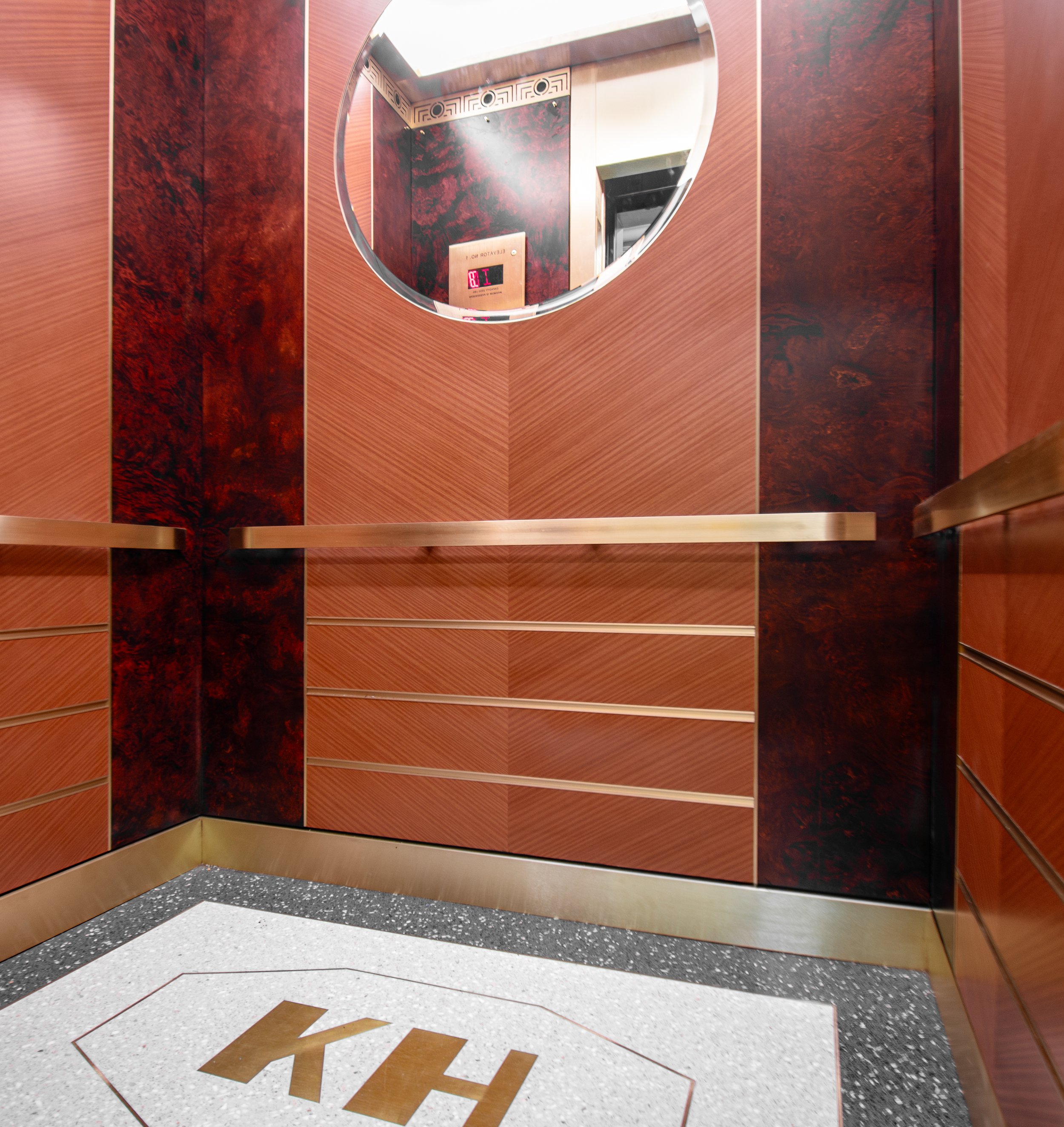
The ceiling of the elevators features a white powder-coated finish, casting a pristine backdrop for the rich textures and materials that follow. Above, a bronze light cove houses a stunning architectural frieze, an homage to the building's historic Art Deco roots. Jannen's meticulous design extends to the wall panels. The center of these panels is adorned with a book-matched mahogany, intricately placed to resemble a chevron pattern. At the same time, the adjacent veneers are faced with exotic oakwood maple burl. Bronze inlays elegantly separate each of these veneers. Each veneer is custom-stained to achieve the desired warmth and elegance. The lower portion of the panels features three bronze U-channels and a flat bronze handrail with bent ends, adding style and functionality to the design. The back wall boasts a stunning large circular clear mirror with beveled edges, elegantly encased in bronze trim. To further celebrate the building's name, "Kensington House," the floors feature a custom-made bronze KH and octagon design, paying homage to the unique exterior awning. An outside vendor manufactured and installed the floors to ensure precision and quality.
Hal states on the resident's elevator reception, "The responses have been very positive. Residents love the overall design and how it evokes the Art Deco period but with a contemporary feel. Even the mechanics who have installed hundreds of elevators throughout the city commented that it looks like something out of the Great Gatsby era." However, the beauty of these elevators is not just skin deep. While aesthetics were paramount, practicality could not be sacrificed. Hal says, "The design of the interiors was very important to us, but because we don't have a service elevator in the building, we needed to consider how this could impact the interiors over time. We had to strike a balance between functionality, durability, and aesthetics." In the journey of 200 West 20th Street's elevators, we witness the harmonious convergence of history and innovation. These elevator interiors pay homage to a golden age while embracing contemporary elegance. As you step into the cab and let the doors close, you will find yourself transported not just between floors but to an era where every detail mattered and artistry and functionality coexisted in perfect harmony. 200 West 20th Street is a testament to the enduring allure of Art Deco design, brought to life anew within the confines of an elevator, proving that, in architecture, every detail is an opportunity for excellence.


